
Can We Start Guiding Users Before They Even Sign Up?
Traditionally, a product walkthrough happens after a user signs up and enters the product — a series of guided steps or prompts that help them understand the features and complete their first actions. This kind of onboarding walkthrough is crucial for smoothing out the learning curve and improving user retention.
But here's something we've noticed:
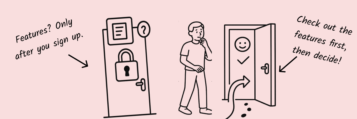
A lot of users are already evaluating your product long before they ever create an account.
As they browse your landing page, hovering over the "Sign up" button, they’re really asking themselves one thing:
“Is this product actually easy to use?”
If we could offer them a clear, lightweight hands-on experience at this stage, could we help them move more quickly and confidently toward signing up?
That's exactly what we set out to explore.
Why Offer a Walkthrough Before Sign-Up?
In practice, we found that relying on text and images alone often struggles to truly convey a product’s value — especially for tools where the "aha" moment comes from actually interacting with the workflow.
Sending users off to watch a video or read a long article can easily lead to drop-off, too.
A walkthrough, at its core, is a mini product demo.
It gives users the chance to see and feel the product for themselves, turning descriptions into experiences and allowing them to "witness" the product’s value firsthand.
That’s why we embedded an interactive walkthrough demo right on Snapdemo’s login page.
No sign-up, no download — just click "Start" and follow a few simple prompts to experience the core of our product, firsthand.
The walkthrough takes less than 7 steps and covers the key features that define Snapdemo’s value. In just about a minute, users can get a strong, intuitive sense of how the product works — and why it matters.
This early experience helped us address two major challenges:
- 🔍Quickly build understanding: New users don’t need to dig through heavy documentation to "get" Snapdemo — they can simply experience it.
- 💡Lower the decision barrier: Offering a real feel of the product before asking for a sign-up makes hesitant users far more confident to click that "Register" button.
Plus, by analyzing user behavior during the demo — time spent, paths taken, completion rates — we gained valuable insights that helped us improve both the product itself and our later onboarding flows.
The pre-sign-up experience isn't just about marketing.
It’s about building a more authentic connection with users, right at the moment they're deciding whether to trust you.
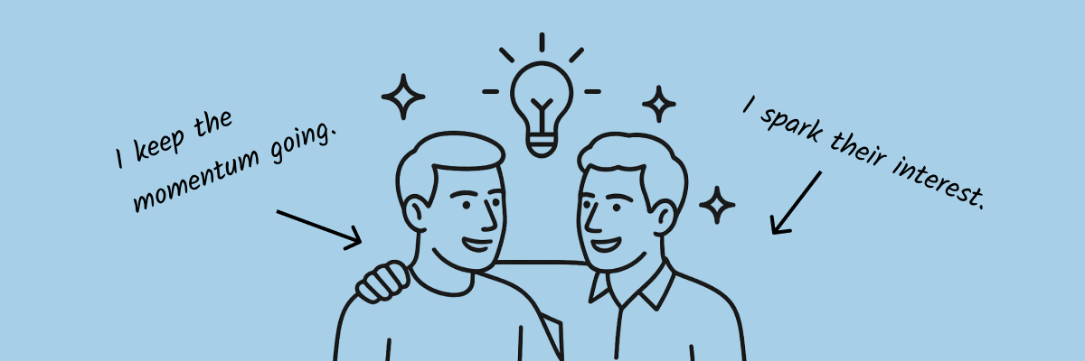
How Pre-Sign-Up Walkthroughs and In-Product Walkthroughs Work Together
Offering a walkthrough before registration doesn’t replace the need for a traditional onboarding walkthrough — it complements and extends it.
Once users enter the real product, they’ll still need deeper, more detailed onboarding to fully explore everything you offer. Each type of walkthrough serves a different decision point along the user journey:
- 👣Pre-sign-up walkthrough: Lowers the barrier to entry and encourages users to give the product a try.
- 📈Post-sign-up onboarding: Guides users into deeper understanding and successful usage.
Ideally, the experience should feel seamless across both stages.
Whether users are clicking through a login-page demo or diving deeper after signing up, we want the tone, visual style, and pacing to stay consistent — so it feels like one smooth, welcoming journey, not two disconnected events.
That kind of continuity goes a long way in elevating the overall product experience.
What Kinds of Products Are a Good Fit for Pre-Sign-Up Walkthroughs?
This approach tends to work especially well for:
- Products where the workflow itself showcases the real value
- Tools that have a slight learning curve, but become intuitive once you get hands-on
- B2B or B2C SaaS products looking to boost sign-up conversions and reduce drop-offs
When you’re dealing with a product that’s hard to fully explain in words,
a lightweight interactive walkthrough can be a very friendly and effective option — and can also serve as a form of User Guide, helping users understand your value proposition through experience rather than description.
It requires far less effort than building an elaborate sandbox environment, and it’s much more engaging than just a static page.
Of course, whether or not you should add a pre-sign-up walkthrough depends on your specific context — your product, your users, your goals.
For super simple content-consumption apps, a short video or GIF might be enough.
But for products with richer feature sets that benefit from a bit of hands-on exploration, a pre-sign-up walkthrough can be a highly cost-effective strategy.
The real key is understanding your users — and giving them the right kind of help at just the right moment.
What to Keep in Mind When Creating a Pre-Sign-Up Walkthrough
As helpful as pre-sign-up walkthroughs can be, there are a few important things to watch out for:
✅Keep It Short and Focused on the Core Experience
Pre-sign-up walkthroughs should be quick and lightweight.
Your goal is to build fast understanding, not introduce another long, complicated process.
Stick to the core highlights — don’t overload users with everything all at once.
✅Make It Feel Natural, Not Forced
A great walkthrough should feel like an invitation to explore, not a mandatory checklist users are being marched through.
Give users a bit of breathing room. Let the experience feel smooth and relaxed.
✅Tie It Seamlessly to the Next Step
When users finish the walkthrough, gently guide them toward the next logical action — like "Sign up" or "Start free trial."
The walkthrough shouldn’t feel isolated; it should be an intentional part of the broader conversion journey.
Common Types of Pre-Sign-Up Walkthroughs
Depending on your product and goals, you might choose different formats for your pre-sign-up experience:
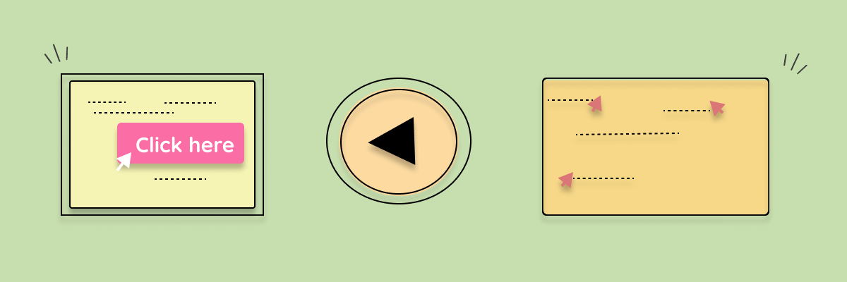
Interactive Demos
Step-by-step interactive experiences like Snapdemo, where users click through and get a hands-on feel for the product.
Perfect for tools with workflows or features that benefit from real interaction.
Micro-Interactions or Short Videos
A short GIF or a 30-second video clip showcasing key moments.
Great for simpler apps where you want to grab attention fast without overwhelming the user.
Clickable Virtual Pages
Simulated pages users can freely click around to "pretend" they're using the product.
These are especially useful if you want to naturally lead users toward signing up or making a purchase as part of the experience.
Each option has its strengths — and you can mix and match based on what fits your product best.
Final Thoughts
Helping users understand your product is never a one-and-done task.
At Snapdemo, we believe in starting that guidance as early as possible — even before a user has signed up —
giving them a chance to experience the value firsthand, in a way that feels natural and effortless.
From early walkthroughs to deeper onboarding, it’s all part of the same journey.
We want every step along that journey to feel lighter, smoother, and more empowering for the user.
If you’re thinking about how to optimize your product guidance, maybe it’s time to start even earlier — to let your walkthrough begin before the first sign-up click.
(Free trial, no credit card needed!)