Some tutorial articles leave me with just one key takeaway:
“Don’t switch windows, or everything will start over.”
You’ve probably had this experience too:
You just want to solve a small issue, but end up reading a seven-paragraph outline, three paragraphs of background info, twelve steps, and three reminders. By step 6, you’re hopping back and forth between the sections, and before you finish, you’re warned, “Don’t forget the hidden button in step 2.”
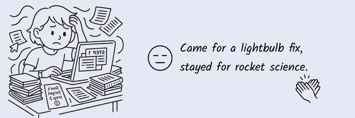
After reading, you’re left a bit confused—like you kind of get it, but not entirely.
“I think I understand... but something feels off.”
That’s when I realized: it’s not that I didn’t “know how to use” the tool, it’s that:
Traditional user guides are too long, too complicated, and too fragmented.
Interactive guides are different. They don’t try to explain everything—they walk you through each step. You don’t need to constantly reference back, you won’t wonder if you missed something, and you won’t be asking, “Where am I in the process again?”
They don’t just “give you the knowledge”—they “help you complete the task.”
Why Traditional Guides Aren’t Ideal for SaaS Product Onboarding
SaaS products are becoming easier to use, but the paths to accomplishing tasks aren’t always intuitive. Many SaaS tools have long user manuals or “getting started” guides that are super thorough. But here’s the problem—they’re too thorough. Plus, with many SaaS products iterating every month, the UI today might not look like the one in last month’s screenshots. No matter how detailed your guide is, if it’s not up-to-date, it’ll be outdated.
What users actually need isn’t completeness—it’s clarity and the ability to follow steps in real-time.
Traditional documentation has a natural flaw:
• It doesn’t do it with you—it tells you “what to do.”
• It assumes you read from start to finish, but users typically read in a “problem-driven” way.
• It forces you to constantly jump between sections, compare, and review, making it easy to skip steps.
It’s like trying to chop vegetables while your phone is propped up against your nose, showing you recipe steps. It’s not that you don’t get the recipe, it’s just that the reading experience is too disjointed.
Why Interactive User Guides Are Better for Modern Product Experiences
I’ve grown to prefer a more “click and move to the next step” method.
An “interactive guide” is much more in sync with a user’s natural rhythm. You click when you’re ready, wait if you need to, and follow along at your own pace.
It shows you one step at a time, without worrying about missing something, switching windows, or wondering, “What step am I on?”
To put it simply, its key characteristics are:
• Step-by-step guidance
• Real-time completion of each task
• No downloads, no page switching, no memorizing previous steps
• Commonly used for product onboarding, feature walkthroughs, and even customer support processes
This approach isn’t about getting users to “watch” something—it’s about getting them to “do” something.
Users Prefer Clickable Product Demos Over Long Guides
Not everyone wants to read through an entire article before getting started. You’ve probably encountered situations like these:
• Explaining a feature to a client, repeatedly sending images + text explanations
• Writing a full guide in Notion or Google Docs, only to have them still ask, “How do I do this step?”
• Recording a tutorial video, but the client still doesn’t know how to do the task, or worse, never even clicks on it
You’ll notice—people don’t mind learning, but the process is too long, and there’s too much information to digest at once.
That’s where a lightweight interactive demo (like the ones we show in our tutorial examples) often works better than sending 10 images and a 4-minute video. It gets people to “get it” much faster.
How Interactive Guides Improve the Product Learning Curve
We can call these “clickable” contents interactive user guides. In simple terms, its structure looks like this:
• A hint
• An interface or interaction
• The next hint
• And so on
There’s no need to log in, watch a video, or schedule training. Users can click and understand as they go. The process is light, flexible, and more likely to stick in their memory.
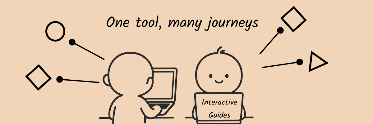
In terms of usage, interactive guides don’t necessarily replace traditional tutorials. Instead, they offer a lighter, quicker alternative to guide users:
Effective Use Cases for Interactive Guides
🔹 Beginner Onboarding
Help users quickly understand “what’s the first step” instead of leaving them to figure it out on their own.
🔹 Core Feature Walkthroughs
Some features are hidden or easily misunderstood. Interactive guidance can lower the learning curve significantly.
🔹 “How To” Questions in Customer Support
Instead of sending a long FAQ, send a link to an interactive demo they can try themselves.
🔹 Sales/Cold-Start Emails
Before users even open the product, they can try out features with a clickable demo. It’s much more likely to spark interest than a long introduction.
At its core, it’s a lightweight sales tool—getting people to take action while also making it easier for them to remember you.
🔹 Internal Training/Collaborative Instructions
Need to train a colleague on a new system? Sending an interactive demo link is far easier than setting up a remote meeting and walking them through it step by step.
Even better, the content can be collaboratively edited. Everyone can quickly add to and improve it, ensuring nothing’s missed.
🔹 New Feature Announcements
Users might not read the release notes, but a small interactive demo can quickly show them “what the new feature does and how to use it.” For instance, in our release notes, users can click through to instantly see the highlights and how to use each new feature.
How to Quickly Get Started with Creating Interactive Product Guides (No Code Required)
Snapdemo makes this super easy.
You can create a simple clickable demo in just a few minutes:
Users click to see the next step, click again to move to the next page. The whole process requires no sign-in, no login, and no developer support.
It can even be embedded on your website or included in a cold-start email. Just click to experience the demo.
This way, you can explain your product in a more intuitive and user-friendly manner.
(Okay, I’ll admit—this part’s a bit of self-promotion): Snapdemo is minimal, distraction-free, supports quick sharing, and offers a free trial—no credit card required.
Final Thoughts: Don’t Rush to “Educate” Users—Let Them “Experience” First
I’ve come to believe more and more that:
Users aren’t rejecting learning—they’re rejecting complexity.
When we turn onboarding into an experience and make learning feel like an exploration, users are more willing to understand and keep using the product.
So, don’t always give them a complete user guide.
Don’t wait for them to click on a video, watch the training, or schedule an onboarding session.
Just give them a little interactive space,
and they’ll navigate the product path themselves.
🪄 Great guidance isn’t about telling users what to do—it’s about making them want to keep doing it.